Someone is standing on a sidewalk two blocks away, deciding between you and the place across the street. They've got your site open on their phone. If they have to pinch and zoom a scanned PDF to find out whether you have anything vegetarian, they're going to the other place. Not because your food is worse. Because deciding took too long.
The menu page is the most visited page on almost every food business website, and it's usually the worst one. Owners spend weeks on the About page and then upload a photo of the chalkboard. It makes sense from the inside: you already know what you serve, so the menu feels like a formality. From the outside it's the only thing anyone came for.
Kill the PDF
This is the first thing to fix and it's not close.
A PDF menu forces your customer to download a file, wait for it to open, then zoom around a page laid out for an 8.5 by 11 sheet of paper on a screen the size of their hand. Search engines struggle with it. Screen readers struggle with it. If someone shares a link to your menu in a group chat, three of their friends will fail to open it.
Put the menu on the page as actual text. Headings, item names, descriptions, prices. Same information, no download, no zooming. It also means when you change something, you edit a line instead of reopening design software, exporting a new file, and uploading it over the old one. Half the outdated menus on the internet are outdated because the owner didn't want to deal with that process again.
The same goes for photographing your printed menu. It's the same problem with worse legibility.
Write descriptions for someone who has never eaten your food
You know what's in the Sunset Wrap. Nobody else does.
Item names that mean something to you and your staff mean nothing to a stranger. Every item needs a short line under it saying what's actually in it. Not a poem. A list of the main components, in the order someone would notice them eating it. Grilled chicken, pickled onion, chipotle crema, in a flour tortilla. Done.
The descriptions also do work you might not expect. They answer the questions people would otherwise have to call and ask, and they quietly handle dietary restrictions. If a description mentions fish sauce, the person avoiding fish doesn't order it and doesn't send it back. If it mentions the aioli, the vegan reader keeps scrolling instead of assuming and then being disappointed.
Skip the adjectives that don't carry information. Delicious, mouth-watering, and famous tell the reader nothing. Hand-cut, smoked overnight, and made to order tell them something real. If you can't say something specific about an item, the item name and the ingredients are enough.
Prices go on the page
Some owners leave prices off because they change, or because they'd rather the customer commit before finding out. Both instincts backfire.
A menu without prices reads as expensive. People assume the worst and go somewhere that told them. Worse, you get phone calls asking what things cost, which is time you spend not cooking. Put the price next to the item, and if you raise prices, change the number. That's the whole maintenance burden of an editable text menu, which is exactly why the PDF has to go.
If you run different pricing for catering or large orders, that's a separate section or a separate page. Don't clutter the main menu with conditional pricing that applies to one customer in fifty.
Structure it the way people order
A long undifferentiated list is hard to read on a phone. Group the menu into the categories your customers already think in: tacos, burritos, sides, drinks. Use real headings for each group so someone scrolling can find their section by the shape of the page rather than by reading every line.
Keep the groups in the order people order in. Mains near the top, drinks and desserts near the bottom. If you have a signature item that most people come for, it goes first in its section, not buried alphabetically.
On a phone, one column is right. Two-column layouts that look elegant on a laptop turn into tiny unreadable text on a phone, and phones are where most people are reading a menu. Build for the phone and let the desktop version be a little plain. Nobody has ever left a restaurant website because the menu was too easy to read.
One more thing about length. If your menu has sixty items across eight sections, consider whether it needs a table of contents at the top with jump links. A short menu doesn't. A long one absolutely does, because the alternative is a lot of thumb-scrolling.
The information around the menu matters as much as the menu
A menu page that only contains a menu is a half-finished page. The person reading it has a second question queued up: how do I get this.
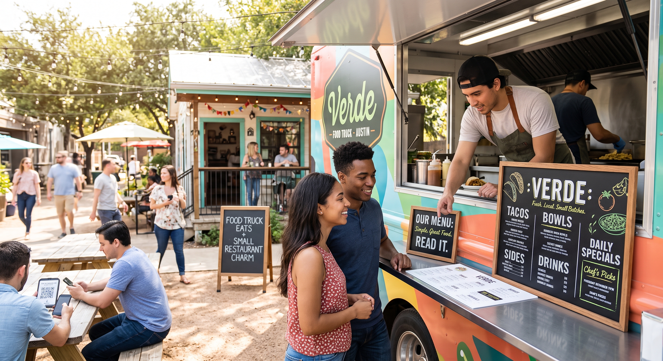
For a restaurant, that means hours and address visible near the menu, not stranded on a Contact page. For a food truck, it means today's location, or a clear pointer to wherever you post it. Food truck customers are the most location-anxious audience on the internet, and a menu with no indication of where you'll be is a tease.
Ordering comes next. If you take orders online, the button goes at the top of the menu and again at the bottom, because people decide at different points. If you take orders by phone, the number should be a tappable link, not typed-out text that someone has to memorize and re-enter into their dialer.
And say what happens when you sell out or when an item is seasonal. A line at the top saying the special changes daily saves you an argument at the window.
Photos: fewer and better
Food photos help, but not the way most people use them.
A photo next to every single item makes the page enormous, slow to load, and visually exhausting. It also invites unflattering comparisons between your good photos and your rushed ones. Pick your best-selling items, shoot those in daylight, and let the rest of the menu stand on its descriptions.
Daylight is the whole trick, by the way. Take the food outside or set it next to a window, shoot from slightly above, no flash. Food photographed under fluorescent kitchen lights looks gray no matter what filter you put on it. If you only ever fix one thing about your food photos, fix the light.
Compress the images before you upload them. A menu page carrying a dozen full-resolution photos loads slowly on a phone with two bars of signal, and the sidewalk customer will not wait.
Handle the daily specials problem honestly
This is where food trucks and small kitchens get stuck. The menu changes. Sometimes daily. Nobody wants to rebuild a web page every morning before service.
The workable answer is to split the menu into two parts. The core menu, the things you always have, lives on the page as permanent text and rarely changes. The rotating part gets one clearly labeled section that you update when you can, with an honest note about how often it changes. If you can only update it weekly, say weekly. If specials are announced on social, say so and link to the account.
What doesn't work is a menu page that promises daily updates and delivers monthly ones. Customers notice, and after they've been burned once they stop trusting the whole page, including the parts that are accurate.
A site that lets you edit menu text from your phone between services makes this much easier to keep up with, which is a big part of why we built sitejourney.ai the way we did. But any setup where updating a price takes under a minute will do the job.
Test it the way a customer would
Open your menu page on your own phone, on cellular data, standing outside. Time how long it takes to answer three questions: what's the cheapest thing, is there anything without meat, and how do I order.
If any of those takes more than a few seconds, you know what to fix first.